


Fantastic fonts and where to find them
my top 10 fantasy and sci-fi fonts for dark lords


Hello my sexy little artists and purveyors of fine things,
Like any good procrastinator, I spent 20+ hours this week shirking my design projects and fantasy manuscript by perusing font libraries. It’s not a casual endeavor. It’s like flying around the Quidditch pitch in search of the golden snitch, when there are rogue, overpriced, terribly designed, and generally uninspiring bludger fonts trying to knock you off your designer broom. And it’s raining modern calligraphy. And there are kerning dementors.
The truth is, a font is no small thing. Perhaps nothing will elevate your Substack header, personal brand, coffee shop, book cover, sparkling water, fashion line, or tattoo design faster than a beautiful font*.
So without further ado and in no particular order, here are my top 10 favorite fantastical fonts inspired by fantasy, science fiction, and the Dark Ages (like all worthwhile things in life).
*If any “typeface” police show up in my comments, I will Brackium Emendo your spines
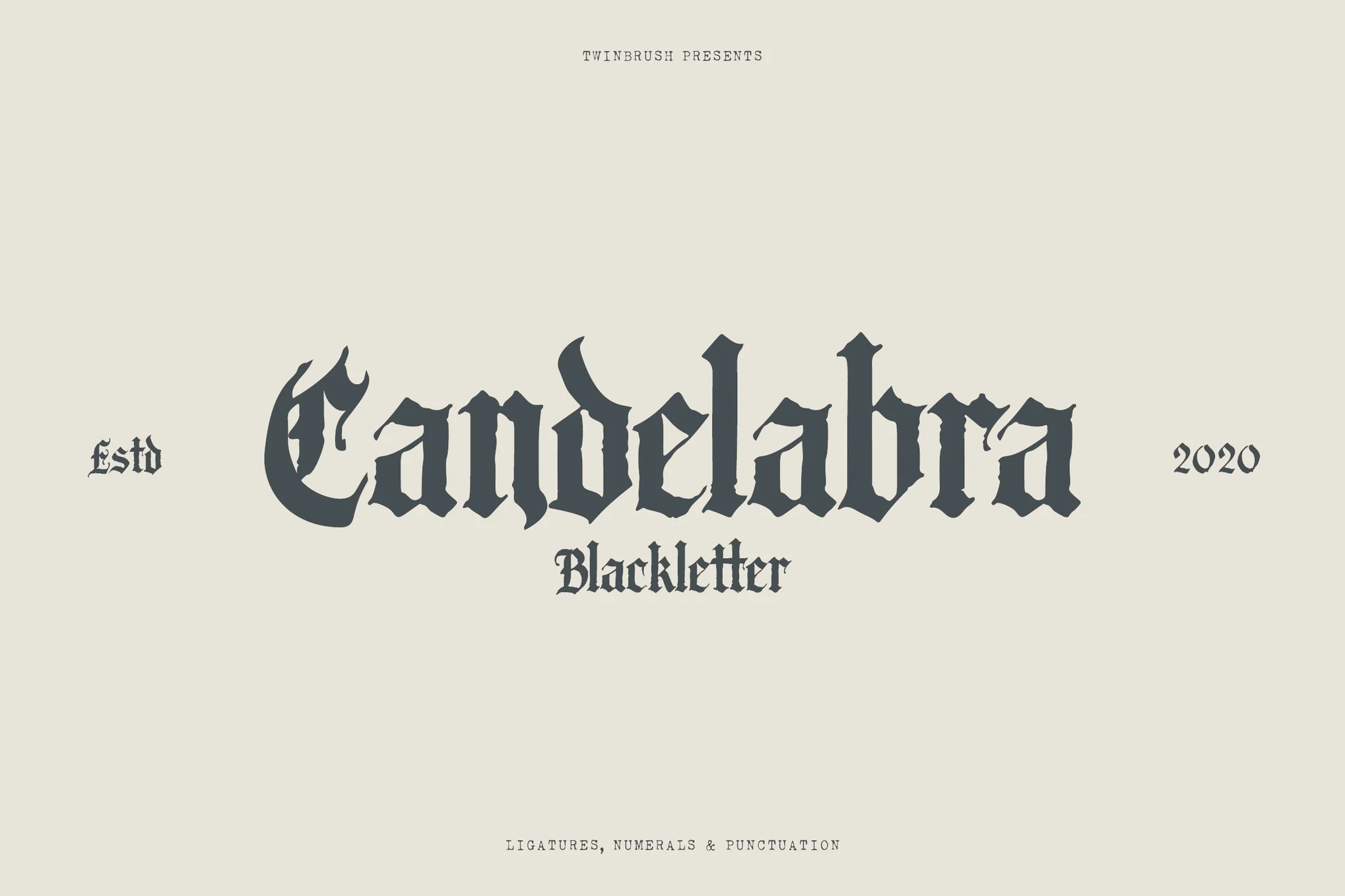
1. Candelabra by Twinbrush — $12+
Naturally, I’m kicking us off with a traditional gothic blackletter font. Look familiar? It’s the lettering I’ve used across Fantasy Camp™ for headers and logos (see screenshot below) since I joined the Substack utopian cult last year. From a technical standpoint, it’s easy to work with, the letters are gorgeously embellished, and it looks great with a dark stroke or drop-shadow.
I’m also partial to it because last year I learned that ‘candelabra’ is actually the plural form of the singular ‘candelabrum’, and I’ve been using that fact to remind people of my intellectual superiority ever since. I bet you didn’t know that.


2. Regrets by Oh No Type Co. — $60+
Most of the time, I’d pay a lot to not have regrets. But for all the work that went into this one, I’m now convinced that Regrets should cost ~$10,000 per letter.
This is a french-inspired, skinny little font that reminds me of olde illuminated manuscripts — especially the flowery ornaments and ornate hand-drawn borders that come with it. It really feels like this one was made with love. I highly recommend you read a little bit about the process.


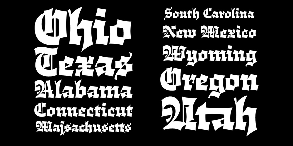
3. Cloisterfuch by Herzberg Design Co. — $40+
“A mean-looking blackletter with a gentle soul, Cloisterfuch is here to remind you that traditions can change for the better.” Herzberg Design Co
Fun! Funky! I appreciate this fresh spin on an over-saturated gothic style. Instead of the traditional angularity and coldness of gothic type, this one is full of life and personality and curves.
Cloisterfuch is a perfect display font for statement moments like wordmarks, embroidered merch, and rock band posters. I’m even tempted to get knuckle tattoos for a spin on the traditional blackletter look.
KONY 2012 or LAVA CAKE — please vote in the comments.

4. Goblin by Type Mania — $29+
I mean, do I even have to explain myself? It’s a Goblin font, made by goblins for goblins. If you pick your nose, this font is for you. Yes, I use this font. No, I won’t be taking questions at this time.

5. Blackbit Pixelated Blackletter by Angin Studio — $24+
Most of the time, I find 8-bit fonts a bit played out, but there’s something special about Blackbit. I love the crunchiness. And it perfectly blends the retro-futurism of pixel fonts with the archaic feel of medieval times. Blackbit is what would happen if Martin Luther rose from the dead and got a design job at Atari.
I’ve said it once and I’ll say it again, 1950’s pulp sci-fi style book covers will be trending soon, and I’ll be ready. WE’LL be ready.


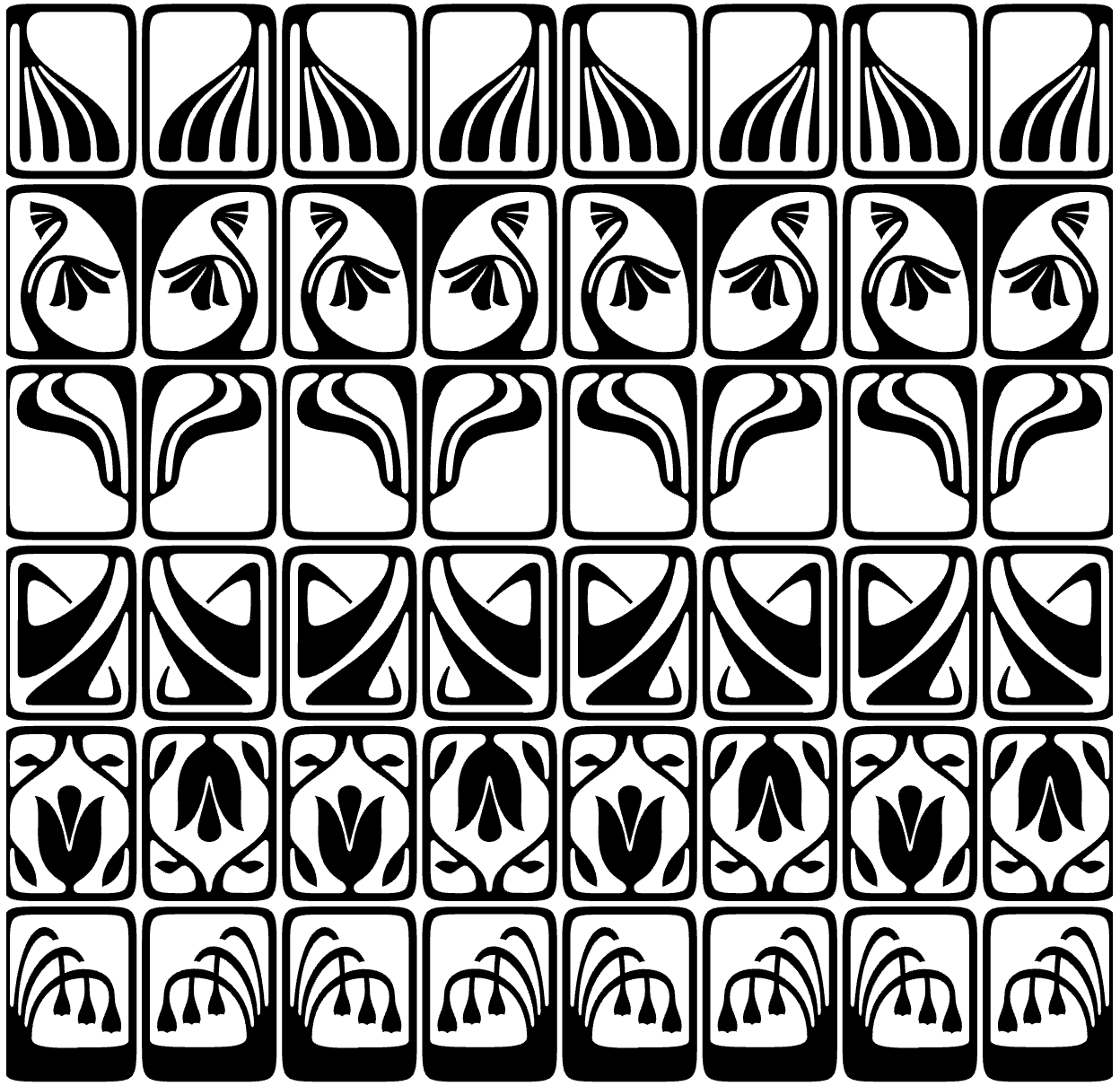
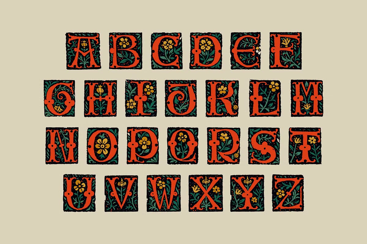
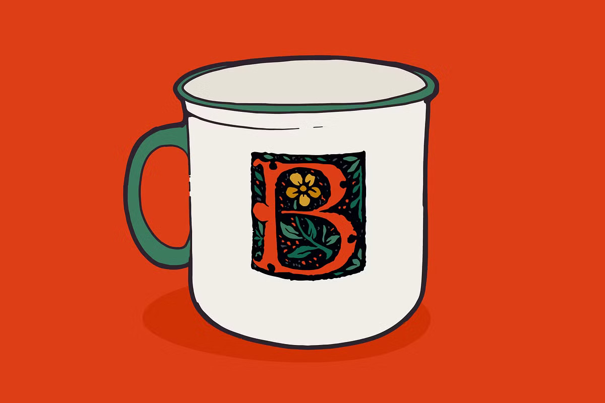
6. Antoine Medieval Drop Caps by Kaer Shop — $24+
These are real initials traced and colorized from the pages of Tristan of the Round Table, published in 1513 by Antoine Verard. Of course, this is an impractical body font, but it makes for the perfect statement initial followed by a tamer blackletter font like Blumen.
The creator of Antoine Medieval Drop Caps is responsible for dozens of other celebrations of real medieval books, with font and illustration families like Bohemian Medieval Initials, Celtic Monograms, and Witch Vector Illustrations. It brings me joy that someone is breathing new life into these little works of art 500 years later.
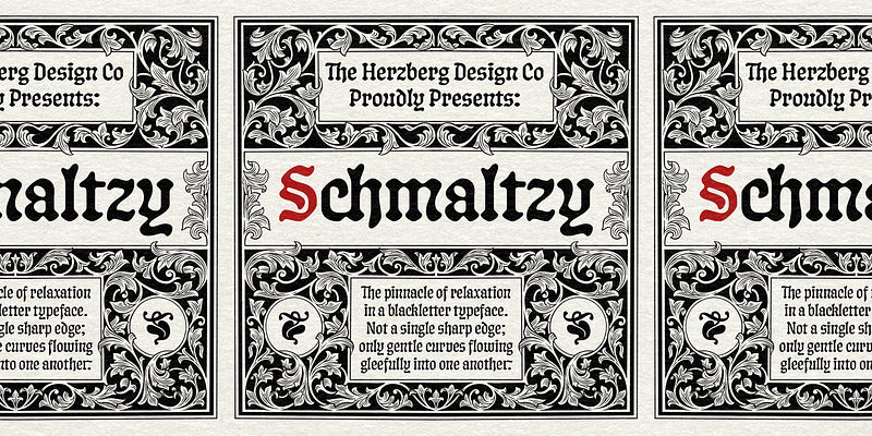
7. Schmaltzy by Herzberg Design Co. — $95+
“Schmaltzy is about as relaxed as a blackletter can get. It contains not a single sharp edge, only smooth curves flowing gleefully into one another.” Herzberg Design Co
Another Herzberg special. What I love about Schmaltzy is that while most blackletter fonts are too flamboyant to allow for other design elements to shine, this one is gentle and unobtrusive.
Thanks to its touch of trendiness, Schmaltzy cannot be put into an archaic box. It’s reminiscent of the squishy silhouettes I associate with Gen-Z brands like Starface, or the liquid metal jewelry of California Dirt. I guess what I’m saying is, Schmaltzy defies the odds by making blackletter approachably modern and warm.


8. Lagarto by Sudtipos (Gabriel Martínez Meave) — $39+
Loopditty doop! Gabriel says this about Lagarto:
“A good friend and typophile came across an unknown manuscript by Luis Lagarto, a colonial illuminator and scribe, working in Mexico City and Puebla in the late 1500s.
The manuscript calligraphy was incredible and stunningly original. It featured three different hands by the scribe… all imbued with an eccentric, convoluted zest and vivacious rhythm. Lagarto is the final result of translating these extraordinary hands into a digital type family.”
This is so beautiful but unfortunately, all I can focus on is that his friend is a typophile and that sounds really really bad. And now I’m afraid I might be a typophile too.


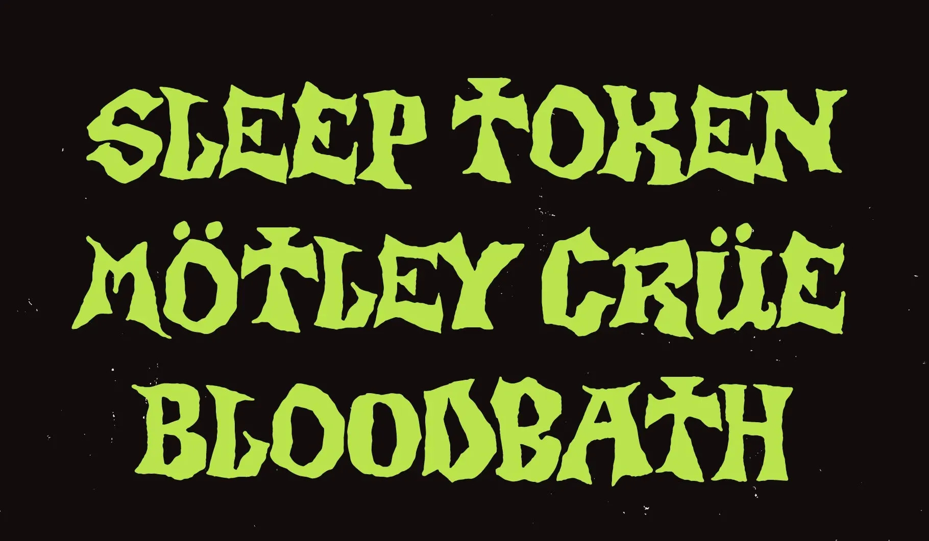
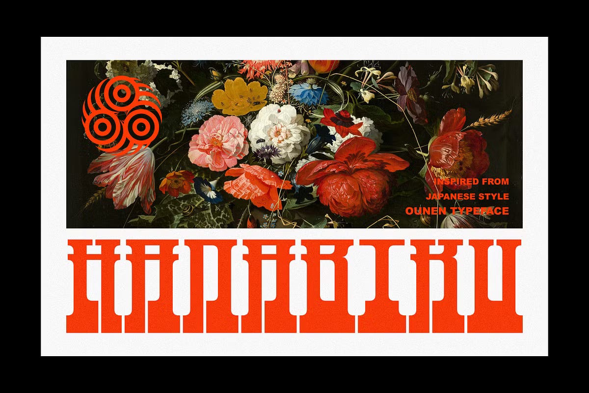
9. OUNEN by Font for Zoula — $18+
I like it. It’s hard to read and it looks like old ruins. Until one second ago, I thought the below graphic said ‘Duned’, that’s how illegible it is. And YET, there’s something incredibly cool about a font that doubles as an illustration.
“Screw legibility, it looks cool!” — an illiterate person, probably

10. Guffaw by Marvadesign — $25+
Disclaimer: I think I may have a bias towards dirty creams and deep reds. But there’s so much to love about Guffaw beyond these delicious sample graphics.
It looks like someone created this with an inkwell of blood and a feather pen. It’s imperfect and loopy and dribbly. The uppercase style is extravagant and delightful. If John Hancock was here today, he’d program his auto-pen to write in Guffaw.


That’s a wrap my people. I hope you loved this week’s Fantastic Fonts and Where to Find Them. If you haven’t been to Fantasy Camp™, come on by. I write stories and special edition posts about fantasy in media, design, and pop culture. It’s free, and we have a bunkbed waiting for you.
Love, laugh, live by the Sword,
Madeleine
Bloody delightful 🖊️ 🤎
This was excellent. And funny.